
TL;DR: Start with the guest, not the camera. I write a photography brief, prepare two possible hero shots, and compare them at the size people actually see on their phones. When it's done right, the winning photo, title, and price make the same promise and tell the same story.
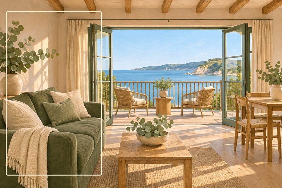
You've probably already seen this: a photograph that perfectly shows a room, space, or location, but has none of the emotional pull to draw people in. It's a super common issue with the people I help.
Ultimately, your listing photos in general, and your hero shot in particular, have three jobs, listed in order: 1) Attract attention on the grid, 2) connect guests with your vibe (the feel or the property as displayed by you, the host), and 3) show people what you're offering.
You have their attention for about 1 second... so you can't screw around with it!
Read on to find out how I approach it.
Listing
optimisation
Improve your photos, title and description with prioritised fixes.
View on FiverrEarnings
analysis
Understand your property’s short-term rental earnings potential.
View on FiverrGuesty audit
& setup
Review your configuration and identify practical fixes for your setup.
View on FiverrAirbnb
mentoring
Work through your next decisions with a focused session or six-session programme.
View on FiverrDecide who the photograph is for
Many hosts, when they first start out, go for what I call the 'Anyone, Anywhere, at Anytime' approach. Feeling under immense pressure to get any booking from anywhere, they try to make their property and photos apply to literally anyone.
Approaching an Airbnb listing like this is honestly terrible. It has the exact opposite effect from what you want, as it fills up your photos and text with all sorts of clutter and mess.
It's also super expensive and stressful - for you AND for your potential guests. The right guest will only have about 3-5 questions they need answered, most of which will be structural. More importantly, they're looking for a space that they, as your paying guests, can connect with emotionally.
They don't want a super generic, boring experience. If they did, they would go to a hotel!
Therefore, your first step is figuring out your ideal 'Who'. I do this by working through a very simple mental exercise on my notepad or laptop. I ask myself three questions:
- The guest: who is the space particularly well suited to?
- The experience: what should staying there feel like?
- The visible proof: what can a photograph show that supports that experience?
For instance, if I'm in a lovely home with a large family room, fireplace, and open-plan dining area, then I would probably imagine a family or several families coming to visit for some precious time away together. We all know what it's like to be constantly flat out and never see each other, so I'd think about the experience of cooking a lovely dinner together, having some time to sit down and laugh together, and finish up around the fireplace (especially if it's in the snow!). This would probably lead me to take some photos of the fireplace, the dining table, set up with plates and glasses, and maybe a wide shot showing how it all flows together.
In contrast, if I had a one-bedroom apartment, right on the beach, I would probably focus more on couple intimacy and views of the water.
This is different from simply listing photographs of the table, dining, and kitchen.
Write the brief before booking the photographer
The next mistake most hosts make is delegating all artistic decision-making to their chosen photographer. It sounds alluring - after all, they are professionals - but generally this is the exact wrong decision to make.
Instead, what you want to do is create an artistic architecture that your photographer can thrive in.
What do I mean by this?
Emotional connection to a space (i.e. your Airbnb) is based on four different aspects: your desired feel, the colors to create the feel, practical outcomes, and focused overwhelm.
For instance, people who stay overnight will almost certainly want a bed (practical). They probably want that room to meet some form of expectation such as calm and relaxing, or busy and opulent (feel). To achieve that feel, you will need to use colors, including furniture, to create it (colors). To gain their booking, you need to show that your place is the absolute best to achieve it (focused overwhelm).
All of these aspects need to be defined for your photographer BEFORE they get set loose in your space to take photos!
I do this by creating a simple 1-2 page brief, broken into 4 sections:
- Desired feel and colors. I describe the atmosphere in plain words. Explain which base colors matter and why.
- Outcomes for each room. I specify what guests need to understand, not just which rooms to photograph.
- Reference layouts. Show how a bed, seating arrangement, or feature should appear.
- Two reference listings. Explain what you like and dislike about their photographs, along with a link.
For bedrooms, I ask for one or two useful views showing the beds so guests understand the sleeping arrangement. For a coffee station, I might ask for a detail that makes the morning routine appealing. For the hero, I want a specific composition, such as the couch with the artwork behind it, rather than “living room photo”.
Brief two candidate hero shots. One becomes the cover; the other gives you a genuinely different option rather than another nearly identical angle.
A worked photography brief
Here is an illustrative brief for a two-bedroom family apartment:
Part / What I would ask for
- Guest and feel: Families wanting an easy, relaxed base. Warm and comfortable, not formal.
- Hero A: Seating area with the artwork clearly visible and enough of the dining area to show how the family uses the space.
- Hero B: Main bedroom with the complete bed arrangement, tidy bedside surfaces and a restrained colour accent.
- Bedrooms: One or two views each, making the bed configuration immediately understandable.
- Kitchen: A clear, practical view, plus a coffee-station detail if it is a genuine feature.
- Supporting details: Dining seats, available high-chair, outdoor seating and the second bedroom.
- Reference notes: Borrow the first reference’s warm colour balance and the second’s clear bed composition, not their décor.
That gives the photographer something to deliver against. It also tells you what to prepare.
Stage the frame, not just the room
A room can feel tidy in person but look messy through a camera. Cables, crowded surfaces, and uneven bedding become much more obvious when you freeze the scene.
I start with a full clean, then work through the planned frames. Remove visible cables and clutter, straighten bedding, clean reflective surfaces, and check what appears around the edges. Put extra effort into the two hero setups.
Use cushions and throws to give a pale room some definition. A simple throw across a white bed can create a focal point without turning the room into a collection of competing colors. In all instances, exercise restraint: styling should reinforce the intended feel, not overwhelm it.
Move small items during the shoot when they improve the composition. A cushion that looks right from the doorway may disappear behind the sofa arm from the camera position. Take a quick test image and adjust what the image shows.
Practical details matter too. For instance, many people feel high chairs look ugly in listing photos, but if you're a family with a young child, it can be absolute gold. That said, you probably wouldn't put it in a hero shot 😆.
Choose a photographer who understands a stay
I look for accommodation photographs that convey warmth and use, not only real-estate photographs that document dimensions.
Show the photographer your brief and ask which composition they would use for the cover. Their answer should connect the image with your intended guest. Ask how they would handle the light, and whether they will make small staging adjustments as they work.
For each hero candidate, request a wider composition and a tighter alternative. Keep the important feature away from the very edge. If a view matters, it needs to remain visible alongside the usable space, rather than becoming a tiny bright window in the background.
Check the results before the setup is dismantled. It is much easier to straighten a throw or change the angle while everyone is still there.
Test the cover at search-card size
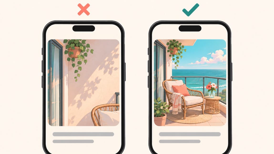
A full-screen photograph is not the final test. The image has to work when it is one small card among several.
Put both candidates on your phone at roughly the size of an accommodation search result. Do not pinch to zoom. Check the horizontal image and a tighter crop so you can see what happens when less of the frame is visible.
Ask:
- Can I identify the main feature immediately?
- Does the room still look inviting without inspecting the details?
- Has the crop cut off a bed, chair, or the feature I meant to lead with?
- Is too much of the image empty ceiling, floor, or blank wall?
- Does the photograph show a stay I can imagine enjoying?
Compare the candidates beside similar nearby properties, not in isolation. If every nearby cover shows a bed, a strong living-space photograph may distinguish yours. If your alternative is a weak room photograph, being different alone is not enough.
Choose the image that communicates the clearest reason to stay. Don't try to rescue an unclear composition by putting several photos into one busy collage.
Make the photo, title, and price agree
Although this article is about photos, the reality is that your hero photo + title + price, all need to agree. Therefore, if your title is about a coastal retreat and all you're showing are photos of the sea, then you're quickly going to run into problems.
The same thing goes with your price. Using tacky images for an expensive listing is dumb.
Instead, take some time to compare your photographed result with what you're claiming in your title and price. Compare dates, guest numbers, and stay length. Then look at the complete card: does the photo explain the value the title and price are asking the guest to recognize?
Turn the first five images into a useful sequence
After the cover earns attention, the next photographs should answer different questions. Five variations of the same room waste that opportunity. Instead, what we want to do is draw people in.
My formula for doing this is pretty simple: sleeping, eating, enjoying, and resting. I want to allocate one photo for each of the below (not including the hero shot which we've already covered.
- At least one sleeping space
- The cooking and/or dining space
- Entertainment space
- A place to rest
Obviously, you need to adapt the order to the property. A standout balcony may deserve second place, or if you have an amazing kitchen and that's part of your vibe, go for that. Basically, the rule you want to follow is that each photograph adds information, rather than complying with a fixed room order.
Your action list
- ☐ Write down the guest, intended feel and visible reason to stay.
- ☐ Prepare the brief, two references and two candidate hero shots.
- ☐ Clean and stage the planned frames; organise a weather backup.
- ☐ Compare both covers on a phone beside relevant alternatives.
- ☐ Align the winning image, title, opening line and price.
- ☐ Reorder the first five photographs and remove weak duplicates.