MACD Indicator Explained, with Examples, Strategies, Limitations, and a little bit of Code
Learn about my exploration into the powerful MACD indicator. I share what I’ve learned, and a quick code snippet for your trading bot


Learn about my exploration into the powerful MACD indicator. I share what I’ve learned, and a quick code snippet for your trading bot
The Moving Average Convergence/Divergence technical indicator (MACD) is one of the most popular trend and momentum indicators in trading. Used by traders worldwide in stocks, FOREX, cryptocurrencies, and futures, it is a technical indicator appreciated for its simplicity and flexibility.
In this article, I’m going to dive deeper into this powerful indicator to show you how you can use it to level up your trading.
What would it take for Crypto, AI, and Cyber to truly change the world?
No spam. Unsubscribe anytime.
The MACD technical indicator is used to identify potential momentum in the market. It does this by comparing two exponential moving averages (EMAs) together and providing a calculation of their differences.
The MACD indicator consists of three components:
To get a visual of what this looks like, I added the MACD indicator to my Algorithmic Trading Bot, along with a secondary Y-Axis. I then created a chart of the BTCUSD currency pair over 1000 30-minute candlesticks. Here’s what it looked like using Dash from Plotly:
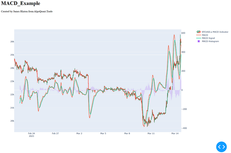
While this looks complex, you can easily see the BTCUSD currency candlesticks, the MACD Line, MACD Signal Line, and MACD Histogram. Naturally, because this graph was generated by Plotly, it’s easy to remove the lines to explore the data further.
The MACD indicator is a comparative function. It takes as inputs two different Exponential Moving Averages (EMA’s), typically the 12-day and 26-day, and then calculates the differences between them.
The MACD calculation goes as follows:
While the typical EMA’s used are the 12-day and 26-day, these can be easily modified for traders who wish to customize the outcomes.
As a momentum indicator, many traders will immediately associate the MACD indicator with the popular Relative Strength Index (RSI) indicator. However, there are some distinct differences I thought I should outline.
The RSI provides insight into a market's overbought and oversold levels, in relation to recent price levels. Overbought or oversold conditions are identified by generating an oscillating signal between the values of 0–100. Readings above 70 indicate overbought conditions and readings below 30 indicate oversold conditions.
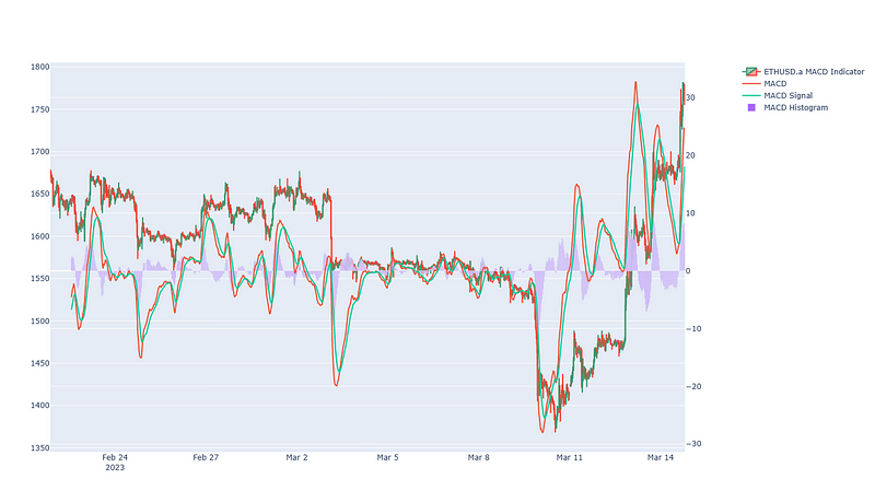
In contrast, the MACD does not have concrete overbought or oversold levels. Instead, the oscillation occurs on a relative basis, with maximum and minimum levels dependent on the pricing levels achieved by the asset. For instance, in the previous chart, it can be seen that the MACD ranges between +600 and -400. In contrast, if I was to use the symbol ETHUSD, this range is reduced to +30 and -30.
A second difference between the two indicators is that the MACD oscillates around a zero signal, often referred to as the ‘Zero Line’. In contrast, the RSI oscillates between 0 and 100.
As a result, traders recommend that the MACD should be interpreted through the lens of level and direction, rather than hard-coded ranges such as 30 and 70.
The MACD indicator is used to measure momentum and identify market trends. It does this by comparing two EMA’s together, then visually displaying their comparative values.
In many ways, it reminds me of a formalized way to implement an EMA Cross Indicator and Strategy, with the extra benefit of the MACD histogram to provide more confidence in buy/sell signals.
Here are a few tips I found on how to use the MACD indicator.
The MACD histogram provides insight into the difference between the MACD line and MACD signal line. When the histogram bars are comparatively large, this indicates a large difference, which in turn indicates that price is rapidly changing. This can indicate momentum in the direction of the histogram.
For instance, using the MACD chart earlier, it can be seen that the BTCUSD dip observed on March 3, 2023 between 00:00 and 12:00 is shown with a comparatively larger histogram size.
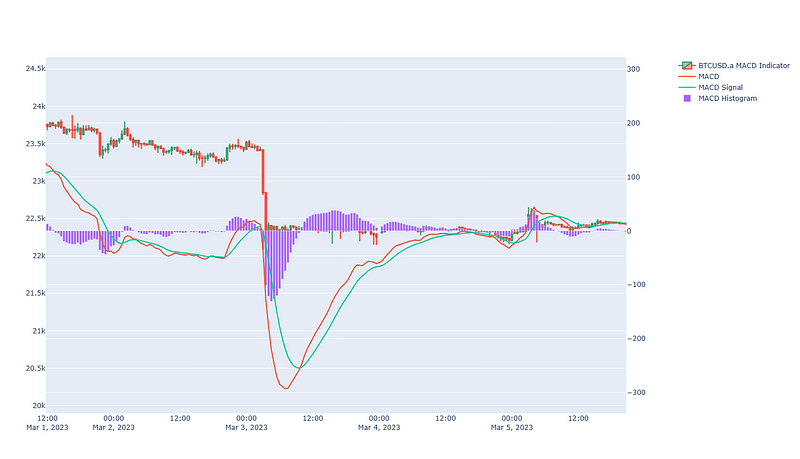
As can be seen, the relatively large size of the histogram bars correctly indicates a large movement in the price of BTCUSD. On March 4, 2023, the relative lack of movement in the price of BTCUSD is represented by comparatively small histogram bars.
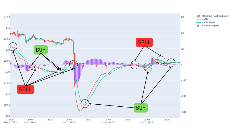
The two lines of the MACD can also be used to identify bullish and bearish momentum. This is known as a MACD Crossover.
When the MACD line crosses below the MACD Signal line, this can indicate that the market is turning bearish. The opposite is also true — when the MACD line crosses above the MACD Signal line, this can indicate the market is turning bullish.
Here’s what this looks like, using the previous graph with observations overlaid:
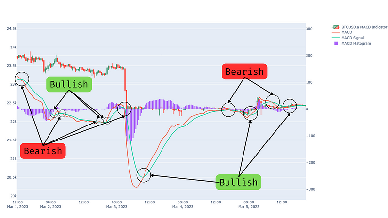
Further detail on each of the crossovers can be gained by comparing the relative size of the histograms at each moment.
A third way to use the MACD is through divergences. The divergence component of the MACD occurs when the highs and lows of the MACD line are opposite the highs and lows of the price movement for the security. For instance, if you were trading a stock, and the stock price was forming lower and lower ‘low’ points, while the MACD line was forming higher and higher ‘high’ points, this would be considered a MACD divergence.
Bullish divergences occur when the price movement is forming lower lows, and the MACD is forming higher highs. This is because the MACD technical indicator is indicating that a market direction change is likely to occur, with the trend reversal moving towards upward momentum.
A bearish divergence occurs when the price movement is forming higher highs, and the MACD is forming lower lows. This is because the MACD technical indicator is indicating that a market direction change is likely to occur, with the trend reversal moving towards downward momentum.
As a widely used technical analysis tool, the MACD technical analysis indicator and ease of interpretation have led to several ‘pure’ MACD Strategies. These strategies can be applied to Forex, Cryptocurrency, Stocks, and Futures.
Over the next few articles (and videos on YouTube), I’ll be demonstrating how to add these strategies to your Trading Bot (including MetaTrader 5 Trading Bot). I’ll be using the Algorithmic Trading Bot to demonstrate.
Why not sign up for my Medium email distribution and YouTube channel if you want to see how it’s done?
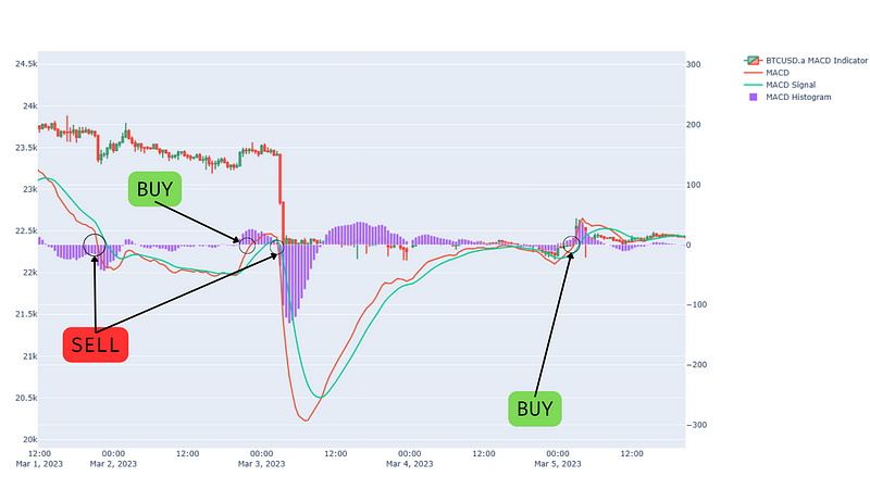
The MACD Crossover Strategy is similar to the EMA Crossover Strategy, however, it uses the MACD line and MACD Signal line to generate crossover events.
In this strategy, a bullish crossover occurs when the MACD line crosses above signal line, and bearish crossover occurs when the MACD line crosses below the signal line.
Here’s what this strategy would look like if I replaced the signals from the chart above with BUY and SELL labels:
I’ll update these links as the articles and videos become available:
A second MACD strategy uses the Zero Line of the MACD oscillation to generate buy signals and sell signals.
In this strategy, a bearish crossover occurs when the MACD line crosses below Zero line and a bullish crossover occurs when the MACD line crosses above the Zero line.
For instance, using the MACD indicator from above, the following signals would be generated:
If you’re interested in seeing how to turn this graph into automated trading, check out these links (I’ll update them as they become available):
Along with ‘pure’ MACD strategies, the MACD can also be used to generate buy and sell signals. These MACD signals can be used independently or as part of a toolkit of technical analysis tools.
As a momentum oscillator, when a MACD line and signal line crossover, this is considered a buy or sell signal. Combining this observation with the size of the MACD histogram can provide insight into the ‘strength’ of the signal.
The MACD Histogram can also identify Buy and Sell signals. For instance, when the histogram is relatively large, this can indicate strong price movement in the direction of the histogram. Traders may add this to their other technical analysis tools to provide further insight into profitable trading activities.
This article provides a complete overview of how to add the MACD Technical Indicator to your Trading Bot. However, if you don’t have time to check it out, here’s a quick bit of code to help:
import talib

def calc_macd(raw_candlestick_dataframe):
    """
    Function to calculate a MACD indicator
    :param dataframe: dataframe of the raw candlestick data
    :return: dataframe with MACD values included
    """
    # Simplify the variable
    dataframe = raw_candlestick_dataframe.copy()
    # Calculate the MACD values in the dataframe
    dataframe['macd'], dataframe['macd_signal'], dataframe['macd_histogram'] = talib.MACD(
        dataframe['close'],
        fastperiod=12,
        slowperiod=26,
        signalperiod=9
    )
    # Return the updated dataframe
return dataframeDespite the power of the MACD indicator, it has a number of deficiencies. As with most technical indicators, it is best used as part of a suite of technical analysis tools, rather than in a standalone strategy. I’ll cover a few weaknesses below.
The MACD is a lagging indicator. The use of EMA’s to generate the core calculations means the MACD can only ever update after a market movement has occurred. While the EMA values can be modified, they are by nature lagging indicators.
As a result, exclusive use of the MACD may mean you miss out on the start/end of market moves. This may reduce your profit.
A second challenge with the MACD is its weakness during sideways markets. During these market periods, the MACD is likely to generate false positive signals and potentially miss trend reversals.
As a result, exclusive use of the MACD may mean you act on false BUY and SELL signals, impacting your overall algorithmic profit.
I love hearing from my readers, so feel free to reach out. It means a ton to me when you clap for my articles or drop a friendly comment — it helps me know that my content is helping.
❤