
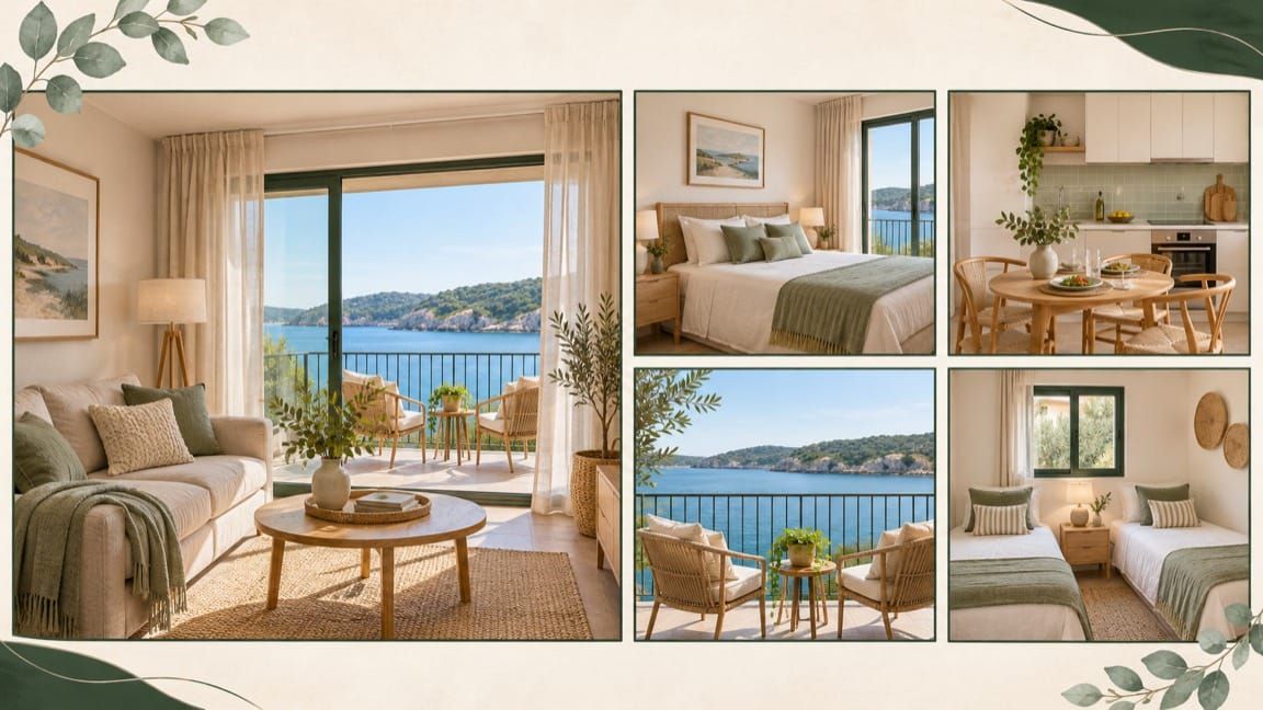
TL;DR: Your cover gets people interested. The next four photos should help them imagine staying: sleeping, eating, enjoying themselves and resting. I choose one useful image for each, cut the duplicates, and move the property's strongest feature forward. The aim is a clear picture of the stay, not a photographic tour of every corner.
You've chosen a great cover. Someone clicks. Then they see the same living room again, a slightly different angle of the same four chairs, a supposedly stylish close-up of a cushion, and a picture of the beach down the road.
It might have sounded good in your head, or looked good when you're in some hyper-focused 'must be stylish to stand out' mode, but honestly? You've probably just lost 70-80% of your potential clients.
What they're really looking for is something far more useful: Where to sleep, where to cook, and where they chill between activities.
Answer these questions up front in your images, and you'll be able to sit back and watch as your bookings skyrocket.
I call it the sleeping, eating, enjoying, and resting approach, and it covers everything after the hero shot, which I covered in my previous article.
Listing optimisation
Improve your photos, title and description with prioritised fixes.
View on FiverrEarnings analysis
Understand your property’s short-term rental earnings potential.
View on FiverrGuesty audit & setup
Review your configuration and identify practical fixes for your setup.
View on FiverrAirbnb mentoring
Work through your next decisions with a focused session or six-session programme.
View on FiverrGive each photograph a job
Before moving photos around, I want to spend a little bit of time describing WHY we make the changes I'm about to outline.
Interestingly, in my opinion, it comes down to the fundamental value of respect. Respecting people's time, respecting their decision-making autonomy, and respecting their needs, wants, and accommodation-related desires.
The majority of people who are looking for Airbnb accommodation are doing so when there's a whole range of different things going. Generally, they're planning a trip, which means they're trying to balance cost, enjoyment, food, travel, kids/family/partner, and all the other things that go into having an amazing time. For you, the booking of your space is the main event, but for your guests, it's just one part of the overall experience.
The primary job of your first five photos is to answer these questions as quickly, efficiently, and beautifully as possible. This shows respect for their time, respect for their choice in accommodation options, and respect for what they consider important in a place to stay.
For a romantic getaway, this might be a nice large bed to 'sleep' in, with an intimate balcony with a beautiful view to share a bottle of wine. For a family, it might be a games room and simple, easy-to-maintain bedroom furniture.
Whatever it is, your photos need to tell THAT story. Not the story of your photographer going on an artistic fever-trip. A close-up of a coffee cup may be lovely, but a guest deciding between two apartments probably needs to see the bedroom first.
The Five Roles
To achieve this outcome, I broke down the first five photos into an easy-to-use formula that pretty much anyone can use. Here's what it is:
Role / What the photograph needs to do
- Hero: Give the right guest a reason to stop and look.
- Sleeping: Show a comfortable place to sleep and make the bed arrangement understandable.
- Eating: Show how guests can prepare or enjoy a meal.
- Enjoying: Show where people can spend time together or do something they came for.
- Resting: Show somewhere to slow down, unwind or enjoy a quiet moment.
The exact order varies by what you're trying to achieve.
Sleeping: show the bed, not just the styling
Have you ever looked at a photo of a bedroom that looks absolutely amazing, and then, when you try to remember the bedding arrangement, you can't recall?
That's a terrible outcome for your guests. It's fine to capture a beautifully folded throw or room setup, but ultimately, you need to answer the sleeping question: where will we sleep?
To do this, use your photography brief. In my photography briefs, I ask for two useful views of each bedroom, and explicitly mention that they MUST feature the bed(s). Each photo MUST show the bed properly, enough space around it to understand the room, and the styling that gives it some personality.
If you have multiple rooms, make sure you designate one as your primary room. This will be the room you use for your first five photos. However, make sure that each room gets a nice photo taken. A family comparing two-bedroom apartments may care more about that room than a second lifestyle image.
A sofa bed needs a photograph in its sleeping configuration somewhere in the gallery. A photograph of a closed sofa shows seating, not the place someone will sleep. Put the setup where it is easy to find and describe it plainly in the caption.
The first five don't have to contain every bed. They do need to make the accommodation feel understandable, not mysterious.
Eating: sell the moment and show the facilities
When it comes to eating, you'll generally have two different aspects: kitchen and dining. In most apartments, these are very close together, while for larger houses, they can be entirely separate.
For my clients, I break this down into two points. A kitchen photograph has a practical job: can guests see what they have to work with? A dining photograph has an emotional one: can they imagine sitting down together?
To achieve this, you want to ensure you capture a few things. Firstly, you want to make sure that your kitchen looks clean yet inviting. A sterile space that looks like a hospital definitely looks clean...but it looks antiseptic. Most people going away love the IDEA of a beautiful kitchen, even if they never end up using it. Therefore, make sure that everything is clean, well-presented, and uncluttered. To get away from sterility, add in a nicely colored knife stand or cooking implement display.
For a table, make sure you set it first. Keep it simple; don't cover every surface with props or hide the working space beneath a pile of decorative objects. Make sure you use the same items as you will have available in your Airbnb.
If there is no full kitchen, show what is actually provided. A neatly presented kitchenette or breakfast setup is more useful than a close crop that leaves people guessing. Make the caption specific enough to explain it.
A coffee-station detail can be a great supporting image. It helps people imagine an early-morning coffee ritual and how they can be part of it, even if they don't actually drink coffee themselves.
Enjoying and resting aren't necessarily the same image
Many Airbnb hosts mistakenly conflate enjoyment and resting together. However, it's actually not.
Enjoying is the active part of the stay: dinner and conversation, a comfortable movie night, a game around the table, or time outdoors together. In contrast, resting is the quieter part: a chair by the window, a balcony looking towards the water, a comfortable couch near the fireplace.
Consciously or not, the people viewing your Airbnb want both. They inherently know there will be time to be active together, and they also know that in the mornings or evenings, they'll want some downtime.
By showing both, you create an emotional attraction.
Every Airbnb will have a different take on this (which is one of the great ways they're different from generic hotels), so spend some time thinking about the people you're trying to attract, and what your space can offer. A spacious family room can show togetherness. A balcony with two comfortable seats can suggest a couple having time to themselves. What you want to do is show people each space so they can invite themselves in to experience it. Do that well and you're 90% of the way to getting a booking.
A worked example: a two-bedroom coastal apartment
Here is an illustrative property: a two-bedroom apartment with an open-plan kitchen and living area, plus a small balcony with a water view. It suits a family or a couple wanting a relaxed coastal base. It's actually very similar to one of my Airbnb arbitrage properties.
Suppose the starting order is:
- Living-room hero.
- Another wide living-room shot.
- The same room from beside the television.
- A decorative coffee-table detail.
- A photograph of the local beach.
There are five photographs, but most of them tell us the same thing. I'd replace that repetition with this sequence:
1. Hero: living area opening towards the balcony
Choose the angle that connects the comfortable indoor space with the view. The image should still make sense at a small size. The water shouldn't be a tiny bright patch that disappears when the photograph is cropped.
Suggested caption: “Open-plan living area leading onto the balcony.”
2. Sleeping: the main bedroom
Show the complete bed setup with a clear, inviting composition. Keep the bedside surfaces tidy and use a restrained color accent if the room is overwhelmingly white.
Suggested caption: “Main bedroom with a queen bed.”
3. Eating: kitchen and dining together
Show the kitchen facilities and the table in the same frame if the layout allows it. This lets guests see how breakfast or dinner would work, rather than having to assemble the room from several close-ups.
Suggested caption: “Kitchen and dining area for meals together.”
4. Resting: the balcony as a place to sit
Show the seats and the view together. A photograph of water alone sells the destination. A photograph showing where guests can sit sells this apartment. The hero has already introduced the balcony; this image should add the detail of actually using it.
Suggested caption: “Balcony seating overlooking the water.”
5. Sleeping: the second bedroom
For this family apartment, I'd use the fifth position to show the twin beds. The hero already establishes shared living space, and the balcony shows somewhere to unwind. Another interior angle would add little beyond showing where the children will sleep.
Suggested caption: “Second bedroom with two single beds.”
That gives us a living-space hero, main bedroom, kitchen and dining, balcony, and twin bedroom. We have covered the four parts of the stay without making every role a separate, rigid slot.
Each caption names the space and adds one useful fact.
Change the order when the property gives you a reason
For a large family home, I might lead with the main living area, then show the dining space, main bedroom, second bedroom and outdoor seating. The extra bedroom matters more than inventing a separate photograph for “resting”.
If the kitchen is genuinely exceptional and central to the experience, it can go second. If the balcony is the strongest reason to book, it might be the hero rather than image five.
The useful question is: what does my guest need to see next?
In my course, I also ask who will enjoy the property on a weekday, not just at the weekend. If the same home serves people working away during the week, a proper workspace may deserve an early photograph. Make that choice because it helps the guest understand the stay, not because you've decided every amenity deserves equal space.
Keep location shots and detail shots in their place
One positioning image can explain a location well. Five generic beach photographs don't explain the apartment.
If you use an aerial or wider location image, make the property's position obvious. A simple, neat marker around the building is more useful than making the reader guess which roof is yours. Keep it separate from photographs of the actual view from the property.
For an opening five, I normally give the space itself priority. Move the location image forward only when it answers an important question that the property photos cannot.
The same applies to decorative details. Keep the coffee station, artwork and carefully styled bedside scene when they add character. Place them after the photographs that establish where guests will sleep, eat and spend time.
Finish the gallery, not just the first five
Once the opening sequence works, organise the remaining photographs so people can find the details they need. My course includes assigning photos to the correct rooms and completing the room information. A good opening should lead into an organised listing, not a random pile of images.
Show the bathroom, the remaining bedrooms, useful amenities and any access detail that is easier to understand visually. Use a caption when it adds information: which bedroom this is, whether a space is shared, or how an alternative bed is configured.
Cut images that are darker, less clear or almost identical to a stronger photograph. Keeping them doesn't make the gallery more complete. It makes the good material harder to find.
Your action plan
Open your current gallery and work through this:
- ☐ Keep one clear hero image.
- ☐ Choose useful images for sleeping, eating, enjoying and resting.
- ☐ Replace any repeated role with a more important missing detail.
- ☐ Move the strongest property-specific benefit forward.
- ☐ Remove weaker duplicates and excessive location photographs.
- ☐ Add factual captions where an image needs explanation.
- ☐ Assign the remaining photos to their rooms and check the full sequence on your phone.
Then look at the first five together. Can you imagine the stay, and can you understand how the space works? That's what you're trying to achieve.